Brand Kit
Welcome to the Swop.Meme brand kit. This guide provides all the essential assets and guidelines needed to maintain consistent brand representation across all platforms. From logos and colors to typography and usage rules, everything you need to represent Swop.Meme professionally is right here.
Usage Guidelines
- Always maintain clear space around the logo
- Use the appropriate logo version for light/dark backgrounds
- Maintain minimum size requirements for legibility
- Do not modify or distort the logo
- Use the official color palette for consistency
Download Assets
All brand assets are available for download in our Drive (opens in a new tab).
Logo Usage
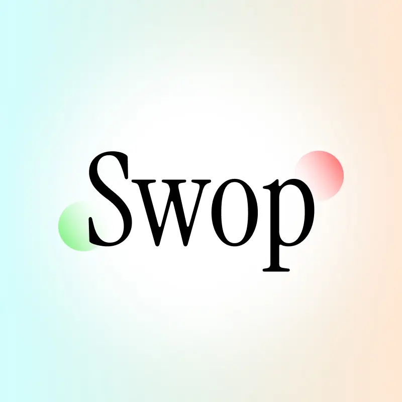
Full Logo (Light)
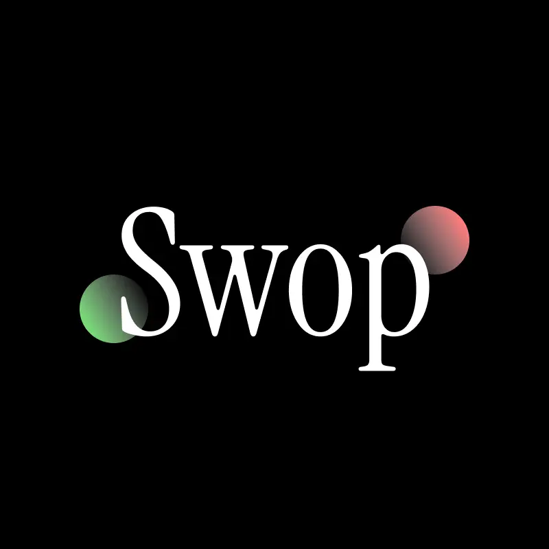
Full Logo (Dark)
Transparent Background Logo (Light)
Transparent Background Logo (Dark)
Color Palette

Primary Colors
Primary Green: #76F376 (Used in logo spheres)
Primary Red: #FF7B7B (Used in logo spheres)
Secondary Colors
Logo Fade Blue: #D1FDFD
Logo Fade Orange: #FFE7D3
Typography
Headings
- Primary Font: Instrument Serif (opens in a new tab) - Used for Website & Socials
- Secondary Font: Inter (opens in a new tab)
- Font Weight: 600
- Sizes: 24px, 20px, 18px, 16px
Body Text
- Font Family: Inter (opens in a new tab)
- Font Weight: 400
- Size: 16px
Additional Fonts
- DM Sans (opens in a new tab) - Used for specific UI elements
SCSS/CSS Variables
Color Variables (Light)
:root {
    --color-white: #FFF;
    --color-bg: #F7F7F7;
    --color-border: #F2F2F2;
    --color-light-grey: #D6D6D6;
    --color-token-component: #F0F0F0;
}
Font Declarations
@font-face {
    font-family: "Inter";
    src: url("/fonts/Inter.ttf");
}

@font-face {
    font-family: "InstrumentSerif-Italic";
    src: url("/fonts/InstrumentSerif-Italic.ttf");
}

@font-face {
    font-family: "InstrumentSerif-Regular";
    src: url("/fonts/InstrumentSerif-Regular.ttf");
}

@font-face {
    font-family: "DmSans";
    src: url("/fonts/DMSans.ttf");
}